
Color Matching
|
Realism relies on correct colors within a painting to achieve a life-like image. The sky is blue, grass is green; this is true for the most part, but it is much more complex. Artists have the entire spectrum of color at their disposal, but yet, color matching can be a challenge. Reality is packed full of subtleties that must be observed, then interpreted by the artist, and finally transferred to the canvas for realism to happen. So labeling the grass as green is an oversimplification; there are also earth tones, yellows, and blues that make it look like grass.
One aspect I have noticed about reality is that color is rarely as intense as it appears. Most paint straight from the tube will need to grayed down and mixed with a more neutral color to drop the chroma to be more accurate. This page will demonstrate my method of matching colors for direct painting. |
|
|
|
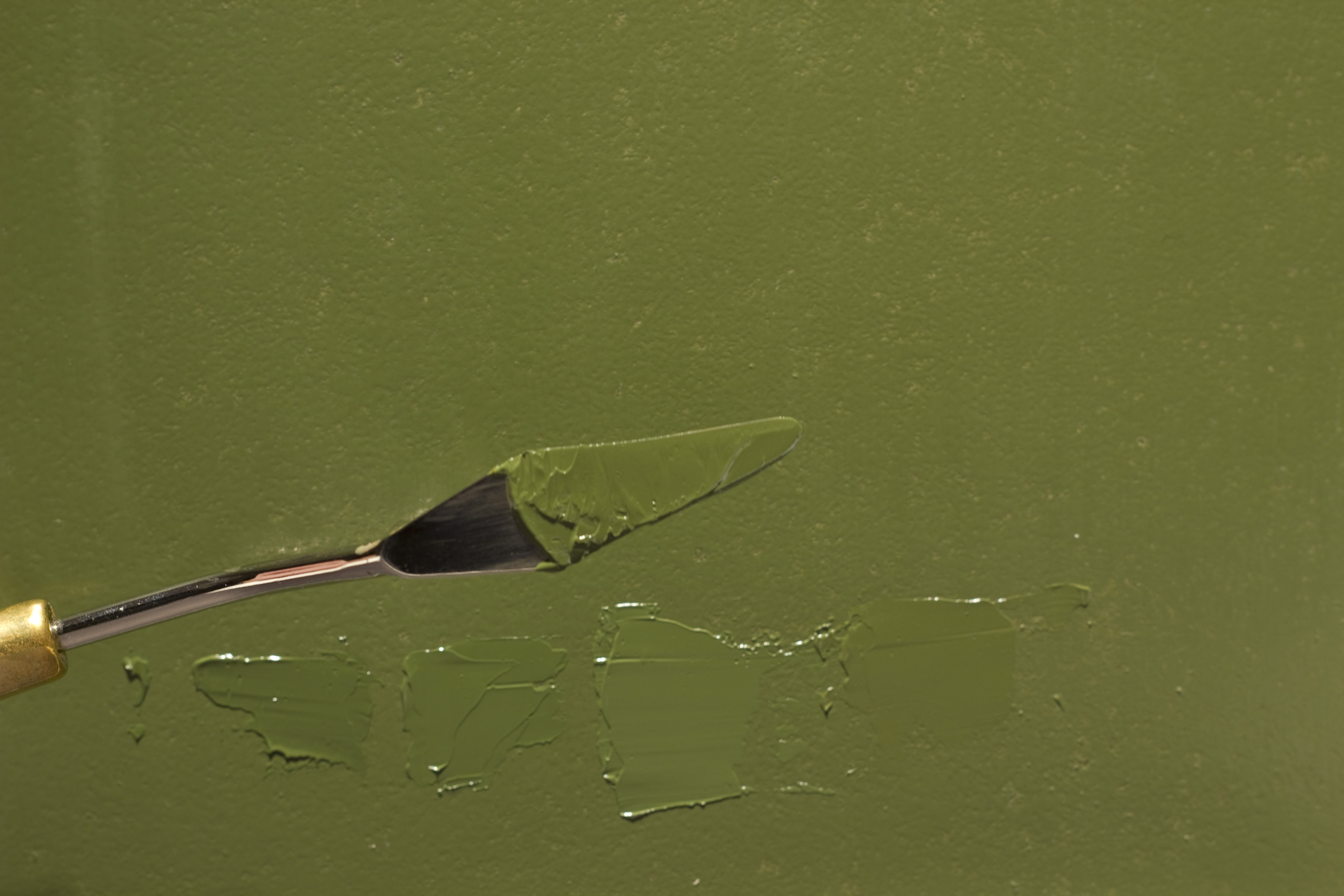
For this demostration, I'll be matching an army green color. It's a color I use fairly often for backgrounds so I know exactly what tubes of paint I need to create this hue. With some practice, color matching will become easier as you gain experience with your paints and learn how they interact with each other.
In the slide show to the left, I use a pallete knife to check the paint against the green background. I use this method for all objects in the painting. It can also be used to match colors in shadow and light. It is important to keep the palatte knife at a consistant angle to achieve an acurrate value. If you were to tilt the paint towards the light source it will look too light and vice versa. Most of the time I can come very close to the actual color. Of course nothing is ever perfect, however I do perfer it to be darn close. |
