The Nitpicky Artist
  • Home
  • About
  • Blog
  • Studio
    • Lights >
      • Types of Lights
      • Color Balanced Light?
      • Standard Bulb vs. PAR Flood Light
      • Soft White vs. Clear
      • Lighting a Painting
      • Lighting Subjects
    • Table and Work Surface >
      • Palette and Cover
      • Brush Holder
      • Thinner/ Spirit Cup
      • Paper Towel Holder
    • Easel
  • Painting Techniques
    • Varnishing A Painting
    • Dust
    • Using Mediums
    • Reducing Glare In The Paint
    • Clove Oil To Slow Drying
    • Painting Small
    • Yellowing of Mediums
    • Constructing Panels
    • Color Matching
    • Wax As A Varnish
  • Career
    • Entering Juried Exhibitions
    • Shipping a Painting
  • Photographing Art
  • Product Reviews
    • Anti-Reflective Glass
    • Gamblin Cold Wax as a Varnish
    • Tube Wringer

"WWII Rations" - ArtSlant Prize Showcase

10/21/2015

0 Comments

 
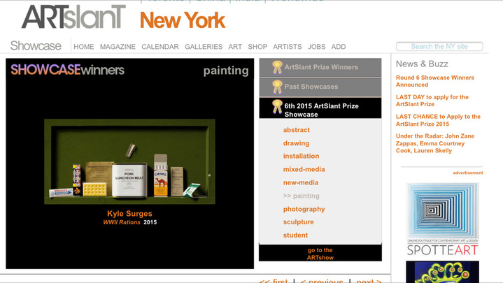
I entered the rations painting into the ArtSlant Prize Competition.  It looks like it has made it's way through the first round of jurying, but so far it hasn't really won anything.  Since this is strictly an online competition, I'm a little doubtful that my painting will go any farther... but who knows?

From here, each Showcase Winner will go before our Gallery Panel for review and judging over the next week.  Gallerists will vote the top 10 Juried Select Winners for the 6th 2015 ArtSlant Prize Showcase. These winning artists will be eligible for the final ArtSlant Prize Competition at the end of our Showcase VII Series.
*Update 10/29/15 - Just as I thought, my painting did not advance to the next level of jurying.  Oh well, that's how it goes.  You win some, you lose many.
Picture
0 Comments

New Work In Progress -  78 Record

10/17/2015

1 Comment

 
Lately I have been working on a commission piece I was fortunate to receive, but I also have another painting going.  There is always some down time while I wait for certain layers of a painting to dry, so the solution is to have more than one painting to work on to keep me busy. 

Last year I completed "Rock N Roll at 78 rpm" and it was well received.  My gallery took it out to an exposition in Palm Springs, California and it sold right away; the painting was gone before I ever got to display it myself in any competitions.   
Picture
"Rock N Roll at 78 rpm"
To add to my trompe l'oeil record collection, I'll be painting another classic 78 record.  78 rpm records predate long play (LP), whole album vinyl which play at 33 rpm.  A 78 has only one song per side, making them 'singles' and are made of a harder shellac material - these are the records you'll see famously being smashed and shattered in old Looney Tunes cartoons. 

This next record painting will be Chuck Berry's "Johnny B. Goode", pressed on the great Chicago blues label, Chess Records.  As you can see below I have a decent start on it, but no real detail yet.
The one problem I face with this record and label is the lack of graphics on it's record sleeve.  Usually record labels have their brand name and logo printed on the sleeve such as RCA Victor dog and phonograph.  I really like seeing vintage advertising and I feel it's a great addition to this type of painting.   I assume Chess never bothered to print a sleeve with their logo for their 78s because I cannot find one anywhere.  They have nice 45 rpm record sleeves with graphics, but nothing for the 78s - they are all blank.     

Luckily, I have an idea.  "Johnny B. Goode" was so influential that NASA included it in the Golden Record featuring the sounds of earth on the Voyager space missions in 1977.   Currently, out beyond our solar system there is "Johnny B. Goode" among other music and sounds traveling and waiting for other intelligent life to discover.  On this Golden Record there is a cover with diagrams demonstrating on how to play the record and how it works, as well as the location of Earth.  Since a plain, graphic-less record sleeve lacks interest, I'm going to invent my own sleeve using the diagrams from the Golden Record.  The second image below is what my sleeve for the painting will look like.  I think this is the extra bit of appeal I'm looking for with this piece.
1 Comment

    Kyle Surges's Oil  Painting Blog


    Keep up to date with the RSS Feed.

    RSS Feed

    Click here to get the RSS Feed Reader for Chrome

    Archives

    October 2019
    July 2019
    February 2019
    January 2019
    December 2018
    October 2018
    September 2018
    June 2018
    May 2018
    February 2018
    December 2017
    November 2017
    October 2017
    September 2017
    August 2017
    July 2017
    June 2017
    April 2017
    March 2017
    January 2017
    December 2016
    November 2016
    October 2016
    September 2016
    August 2016
    July 2016
    June 2016
    May 2016
    April 2016
    March 2016
    February 2016
    January 2016
    December 2015
    November 2015
    October 2015
    September 2015
    August 2015
    July 2015
    June 2015
    May 2015
    April 2015
    February 2015
    January 2015
    November 2014
    October 2014
    September 2014
    August 2014

    This website is 100% safe.  The ads you see here are simply to help fund this site.  They are clean, non-popup ads provided by Google.  If an ad is clicked, you will be directed to another safe website and Google will pay me a few cents.  Your support is greatly appreciated.
Powered by Create your own unique website with customizable templates.